Stage App Theming
All Stage apps include built-in support for light and dark mode. The theme system uses CSS custom properties scoped by a data-theme attribute on the document root, with localStorage persistence and OS preference detection.
The useTheme Hook
Every Stage app should use the useTheme hook to manage theme state:
function useTheme(): {
  theme: "light" | "dark";
  toggle: () => void;
}
Behavior:
- On mount, reads
localStorage.getItem("shift-theme") - Falls back to OS preference via
window.matchMedia("(prefers-color-scheme: dark)") - Sets
document.documentElement.setAttribute("data-theme", theme) - Persists changes to
localStorageon every toggle
Usage:
function App() {
  const { theme, toggle } = useTheme();

  return (
    <div>
      <ThemeToggle theme={theme} toggle={toggle} />
      <main>{/* app content */}</main>
    </div>
  );
}
The ThemeToggle Component
The standard toggle component renders a sun/moon button:
function ThemeToggle({
  theme,
  toggle,
}: {
  theme: "light" | "dark";
  toggle: () => void;
}) {
  return (
    <button
      onClick={toggle}
      aria-label={`Switch to ${theme === "light" ? "dark" : "light"} mode`}
      style={{ background: "none", border: "none", cursor: "pointer", fontSize: "1.2rem" }}
    >
      {theme === "dark" ? "\u2600\uFE0F" : "\uD83C\uDF19"}
    </button>
  );
}
Place the toggle in your app's header or navigation bar.
CSS Token Scoping
Theme tokens are defined using [data-theme] selectors, not prefers-color-scheme media queries. This ensures the JavaScript toggle takes precedence over OS settings.
/* Light mode tokens (default) */
:root,
[data-theme="light"] {
  --bg-primary: #ffffff;
  --bg-secondary: #f5f5f5;
  --text-primary: #1a1a1a;
  --text-secondary: #666666;
  --border-color: #e0e0e0;
  --accent: #2563eb;
  --shadow: 0 1px 3px rgba(0, 0, 0, 0.1);
}

/* Dark mode tokens */
[data-theme="dark"] {
  --bg-primary: #1a1a1a;
  --bg-secondary: #2a2a2a;
  --text-primary: #f0f0f0;
  --text-secondary: #a0a0a0;
  --border-color: #333333;
  --accent: #60a5fa;
  --shadow: 0 1px 3px rgba(0, 0, 0, 0.4);
}
| Dark Mode | Light Mode |
|---|---|
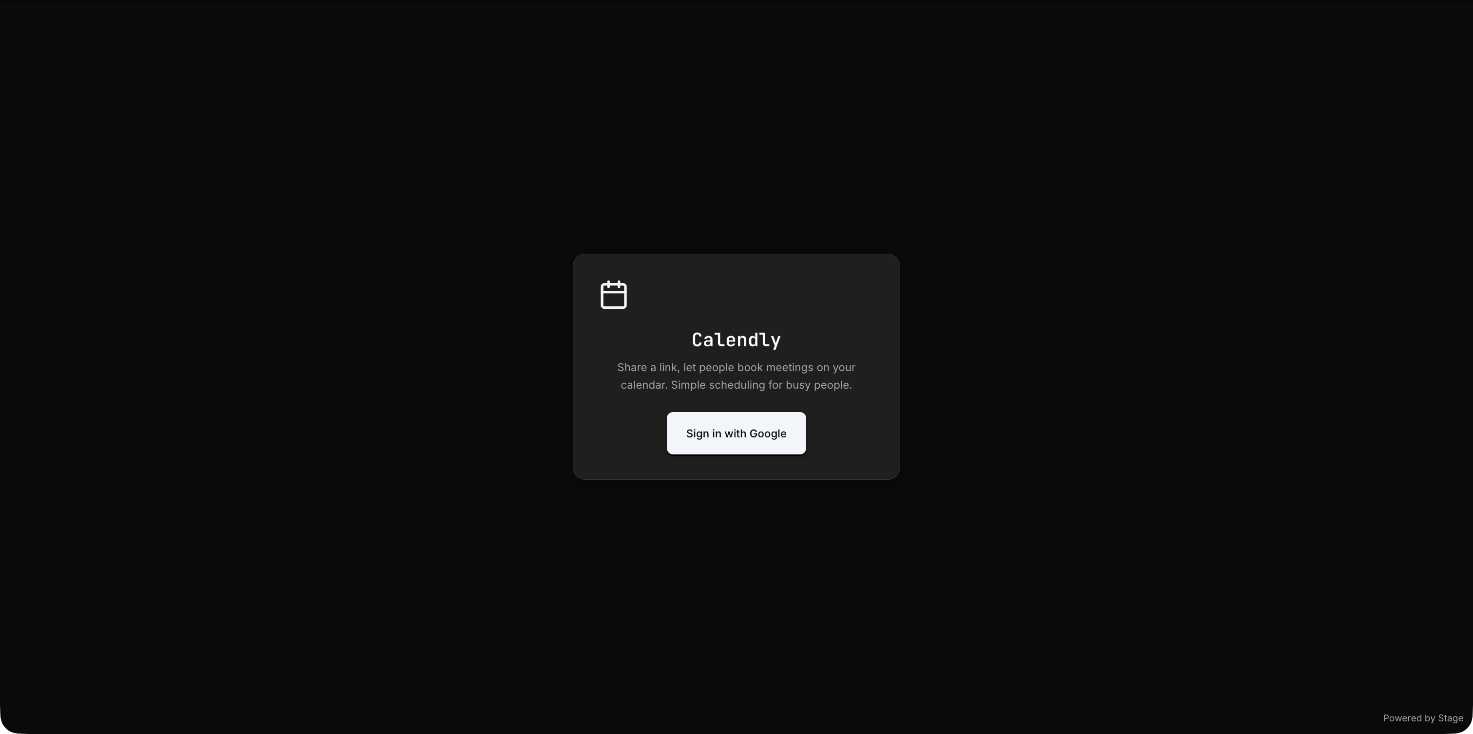 | 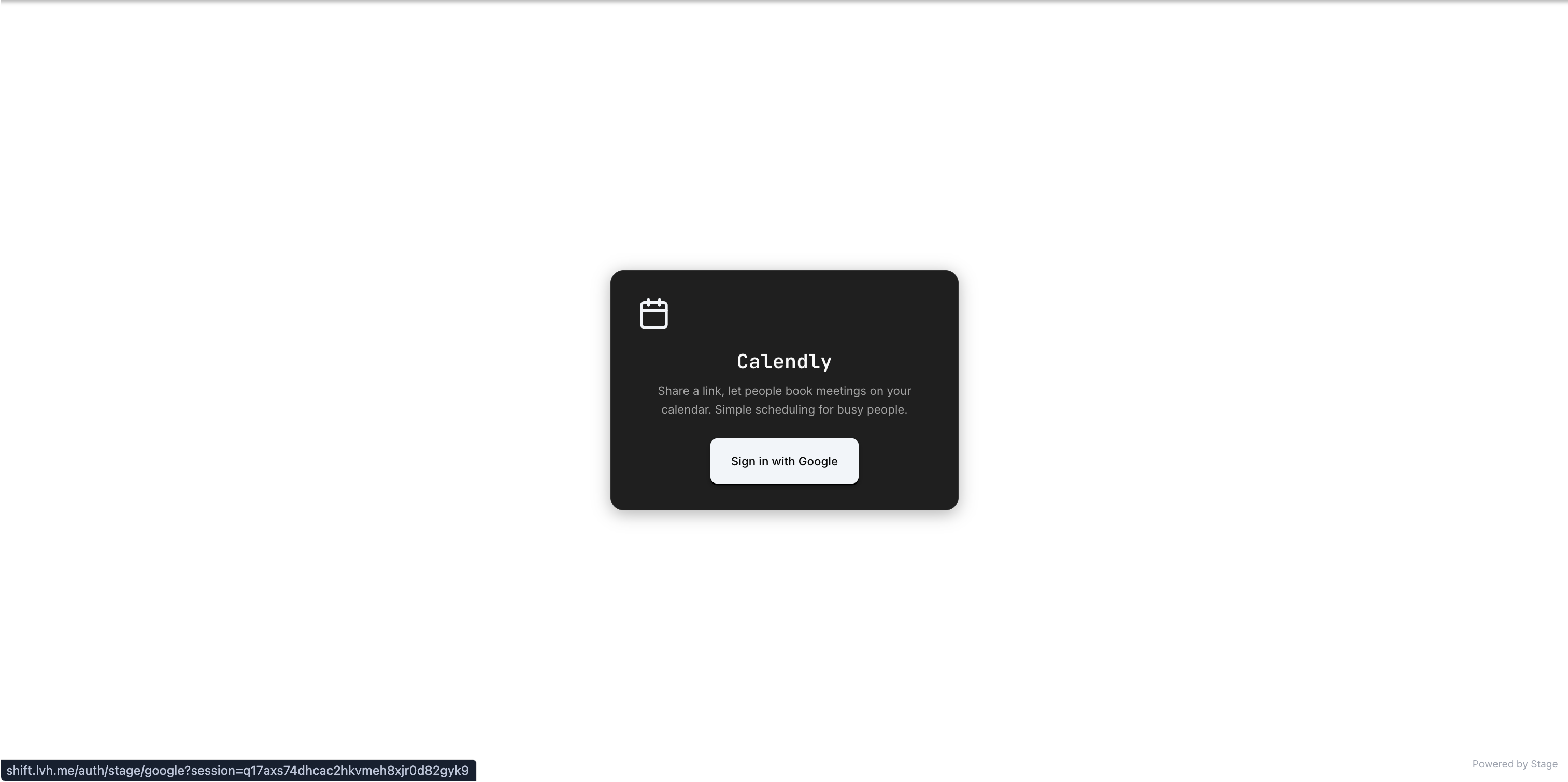 |
Reference tokens in your components:
.card {
  background: var(--bg-secondary);
  color: var(--text-primary);
  border: 1px solid var(--border-color);
  box-shadow: var(--shadow);
}
Palette Integration
When your app uses a Palette theme, the token variables are automatically populated from the palette's design tokens. Your CSS should always reference var(--token-name) rather than hard-coded colors to ensure palette compatibility.
Requirements
The theme toggle is mandatory for all new Stage apps. Your app must:
- Include the
useThemehook andThemeTogglecomponent - Use CSS custom properties for all colors, shadows, and theme-dependent values
- Support both light and dark modes without layout breakage
- Persist the user's choice via localStorage (
shift-themekey)
Retryable Bootstrap States
Stage apps must handle all bootstrap states gracefully. Never gate on if (!resource) return null. Instead, always render a meaningful UI for each state:
| State | UI |
|---|---|
loading | Spinner or skeleton with status text |
unauthenticated | Login prompt with clear CTA |
ready | Full app UI |
error | Error message with retry button |
Every error state should include a retry CTA that re-triggers the failed operation.